ParkingMeter — Manage Your Parking Fines Without the Headache
Parking tickets are stressful enough. I designed ParkingMeter as a calm, mobile-first way for drivers to look up tickets, understand what they owe, pay securely, or start an appeal without fighting confusing portals.
Project snapshot
- Mobile app for ticket lookup, payment, and appeals.
- Built around low-friction entry: license plate, VIN, or DMV login.
- Accessibility-first UI with clear hierarchy and predictable flows.
Problem
Getting a parking ticket is stressful. Paying or appealing it online is often worse. Every city uses a different portal, language is inconsistent, and appeals are buried behind multiple steps. Many systems are not designed with accessibility in mind.
I wanted to design a flow where a driver can say:
“Let me see my ticket and take action”
without having to make an account or dig through menus.
Who I designed for
- Busy commuters who want to quickly pay and move on.
- Tourists and temporary drivers unfamiliar with local portals.
- Rental car users dealing with tickets on vehicles they don’t own.
- Drivers who want to appeal but feel the system is stacked against them.
Design Goals
- Reduce friction: let users verify with a plate, VIN, or DMV login instead of forced account creation.
- Make status obvious: separate views for current, past, and appealed tickets.
- Give users control: don’t hide the appeal option or bury it behind multiple clicks.
- Lead with accessibility: high contrast, clear labels, and predictable patterns for keyboard and screen readers.
User Flows & Key Screens
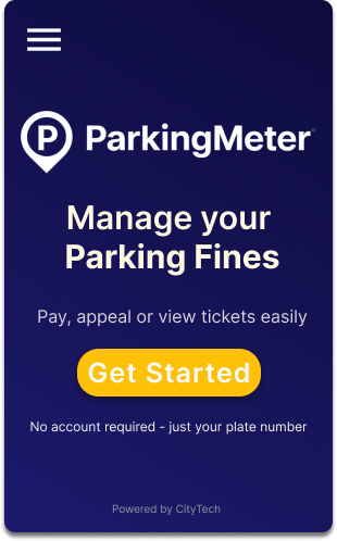
1. Getting started: from anxiety to clarity
The home screen is intentionally calm. Instead of warnings or legal language, it focuses on a single primary action: Get Started. This lowers cognitive pressure for users who are already stressed.
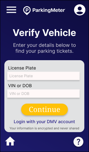
2. Verify vehicle: flexible entry
To respect different memory habits, users can verify their vehicle using a license plate, VIN, or DMV account login. All fields use clear labels, generous tap targets, and straightforward error states.
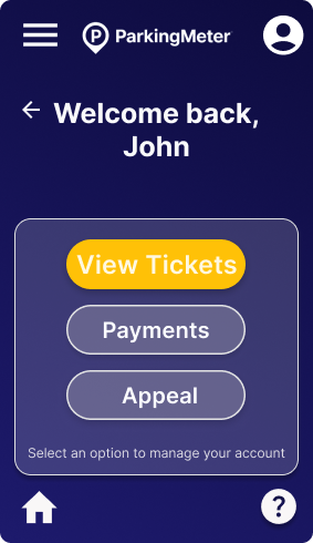
3. Welcome screen: simple hub
After verification, users land on a small “home base” where they can choose: View Tickets, Payments, or Appeal. Instead of dumping all details at once, I give them a calm decision point.
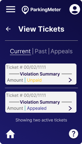
4. Ticket overview: organized by state
Tickets are organized under three tabs: Current, Past, and Appeals. Each ticket card shows the issue date, amount, location, and status so users can quickly scan where they stand.
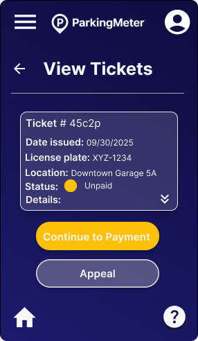
5. Ticket details: clear options to pay or appeal
A ticket detail view exposes all of the important information in one place—violation type, date, address, amount, and status. At the bottom, users see two strong options: Continue to payment or Appeal. I intentionally kept the appeal button visible and not hidden in a menu.
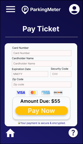
6. Payment & confirmation
The payment form is minimal by design: card fields, billing ZIP, and a clear amount due. Once a payment is completed, the success screen reassures the user that the ticket is resolved and offers a clear “Return home” button.
Accessibility Decisions
As a Trusted Tester, accessibility isn’t an afterthought for me. It shaped the structure of the flows and UI from the beginning.
Color & contrast
- Dark navy background with bright yellow CTAs creates strong contrast while keeping the overall tone calm.
- Avoided yellow text on white, which would fail WCAG contrast in real usage.
Screen reader behavior
- Buttons use meaningful labels like “Continue to payment” rather than generic “Continue”.
- Ticket cards are announced with status and amount so users don’t have to drill into every detail view.
Keyboard and touch
- All interactive elements respect min 44×44px targets for touch.
- Navigation flows in a logical order without traps or off-screen focus jumps.
Predictable patterns
Tabs, cards, and large CTA buttons are repeated consistently so users can rely on patterns, not guesswork. This helps everyone, but especially people with cognitive load, anxiety, or executive function challenges.
Edge Cases & Future Improvements
Edge cases I accounted for
- Invalid license plate / VIN entry with clear inline error messaging.
- Ticket not found state with next steps (contact support or re-check inputs).
- Payment declined with options to try again or switch methods.
- No current tickets (“You’re all clear!”) instead of an empty, confusing screen.
- Appeal submitted / in review states so users aren’t left wondering what’s happening.
Next steps I’d love to explore
- Apple Pay / Google Pay integration for one-tap payments.
- Upload supporting evidence for appeals, including photos and documents.
- In-app reminders before late fees are applied.
- A fleet view for rental companies or commercial operators handling multiple vehicles.
Reflection
Designing ParkingMeter reminded me how often public systems are built around internal bureaucracy instead of real people. I flipped that: I designed for the driver first.
My biggest takeaway is how much stress you can remove simply by making flows predictable, labels honest, and accessibility part of the foundation instead of a checklist at the end.
This project combines what I care about most as a designer: inclusive experiences, clarity under stress, and translating complex systems into calm, human interfaces.